Scatterplot
Source: Data Visualisation Catalogue - Scatterplot
Why This Belongs In The Compiler Gallery
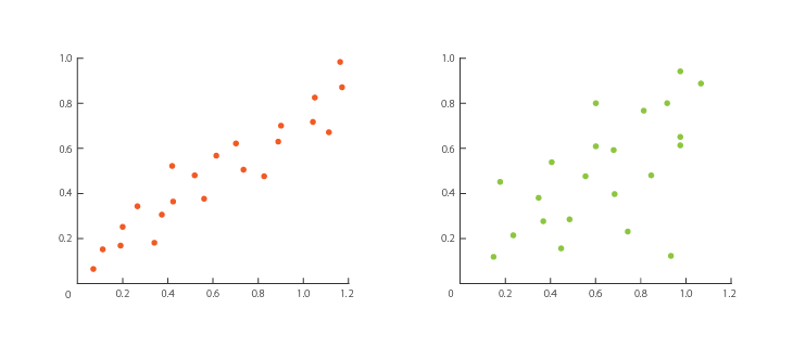
The catalogue scatterplot places points on Cartesian axes to reveal relationships between two variables. That is the compiler's most direct use of the point glyph with two linear scales. It should be the canonical point-mark example before more complex bubble and map variants.
Data Contract
Each data row represents one observation.
| Field | Type | Purpose |
|---|---|---|
x | quantitative | Horizontal variable. |
y | quantitative | Vertical variable. |
id or label | text | Observation identity. |
category | categorical, optional | Point color grouping. |
size | quantitative, optional | Optional radius, though bubble chart should own size-as-area semantics. |
trend output | derived | Regression endpoints, slope, intercept, and r-squared generated from raw points when requested. |
Expected Visual
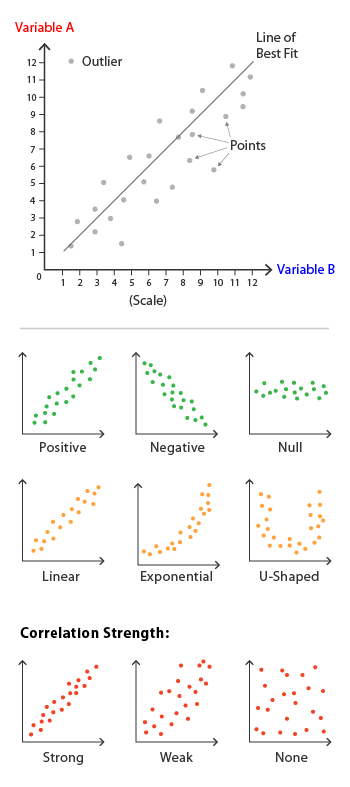
A faithful scatterplot should show discrete points positioned by two quantitative axes. The reference anatomy emphasizes variables, outliers, correlations, and optional trend lines. The first gallery version should include axis guides and an optional line of best fit only if it is supplied as modeled data.
| Element | Expected treatment |
|---|---|
| Points | Same radius by default, with opacity for overlap. |
| Axes | Linear x and y scales. |
| Outliers | Naturally visible by position; optional labels for notable points. |
| Trend line | Optional path layer from compiler-generated regression output. |
| Color | Optional categorical field, not decorative. |
Compiler Mapping
| Compiler part | Mapping |
|---|---|
| Data source | points table and derived trend table. |
| Transform | regression creates trend endpoints from raw x/y observations. |
| Scales | x: linear, y: linear, optional color: ordinal. |
| Layers | point observations, optional path trend line, line grid, text axis/point labels. |
| Interaction | Point hover should expose x, y, label, category, and source row. |
Faithfulness Notes
Do not conflate scatterplot and bubble chart. Scatterplot points should default to a constant radius; bubble charts should use radius to encode a third variable by area.